I've been asked to make another design proposal for the Minidebconf. People have been brainstorming. I could have asked them to do that months ago. I didn't, because I was working with my own ideas.
We need to know who and what we are aiming at with the graphic communication, as well as with the conference. Who is the design for? What should they do? Why? Who is the conference for? Who should be interested?
Is the design for people in Barcelona only? Is it for women only? Is it for current developers? Or is it for local politicians? Male or female? Students? - only? Does the communication have other goals than getting people at the venue? Should the design reflect the organizers - or rather not? Does the geography have to play a role in the visual imagery?
These are questions that should always be asked. I made the mistake to answer a lot of the questions myself, based on my second hand knowledge and guesses. A common mistake, I've made before and will probably make again. I'm used to working on my own, that's my poor excuse.
To my mind, the gathering, the meeting in the flesh and the communication and sharing of knowledge, is far more important than local landmarks.
I don't feel that strongly for a location oriented identity design. La Sagrada Familia doesn't have anything to do with a gathering for free software development, does it. How?
Oh, that was the minidebconf in Barcelona
Oh, that was the minidebconf arranged by Debian Women
Oh, that was the minidebconf that made a point out of being inclusive
Oh, that was the minidebconf that…
The identity design might have more to do with support to the local group than with any of the other aspects of the conference. Interesting.
This table of colors shows different ways a blue and a purple
could go. I put the green colors there to have more options
covered for the discussion today. You can see how the different
hues interacts with the red of the logo.
The colors can be referred to like this: B3, C6, A4 etc.
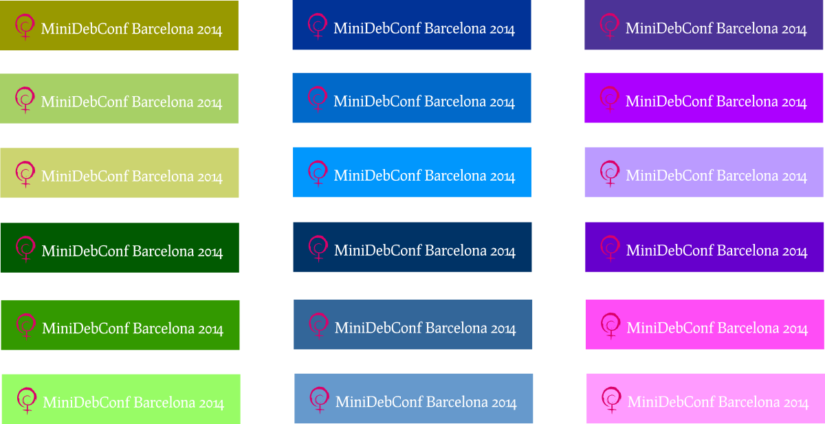
Click on the image for full size version.
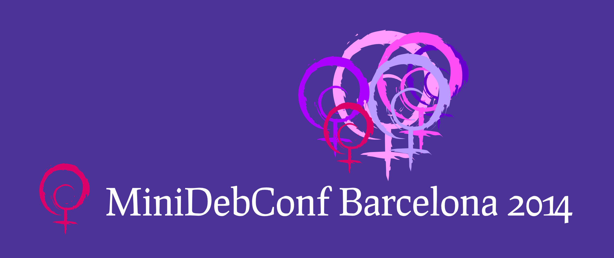
Here is an idea based on all the purple colors. Fun, uplifting,
feels like many voices. Too many colors for T-shirt print, maybe:

Here is some ideas of how to implement a minimalistic
solution that I recommend for minidebconfs:
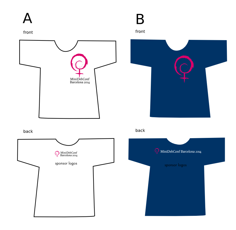
My suggestion is that the banner (and everything else displaying the event) has the logo of the organizers placed on it. The font used for headlines etc is semantically of another nature than the logo, though it could be the same. I prefer neutral fonts, that can be reused by the next minidebconf, and I suggest a sans serif font. A condensed font makes huge display easier to fit.
Don't be confused by displayfonts, I aim to show you that type
alone speaks loudly, and if this typography should be recycled,
we should not choose one of them, but go with the "neutral" sans
serif.
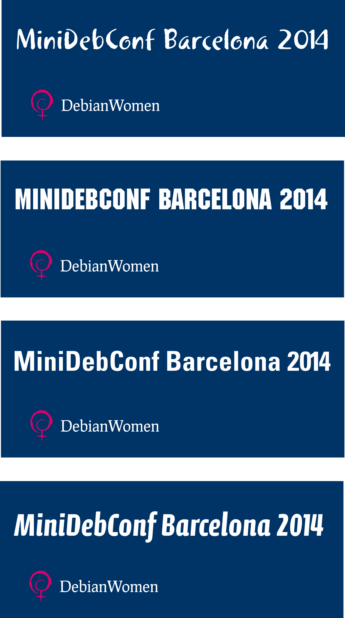
I need suggestions of free and good sans serif fonts.